The client:
Brightland is a premium pantry brand known for bringing design, storytelling, and ingredient transparency to categories that have traditionally been treated as commodities. From olive oils and vinegars to pantry essentials, every product is designed to make everyday cooking feel more intentional, beautiful, and joyful.
The work:
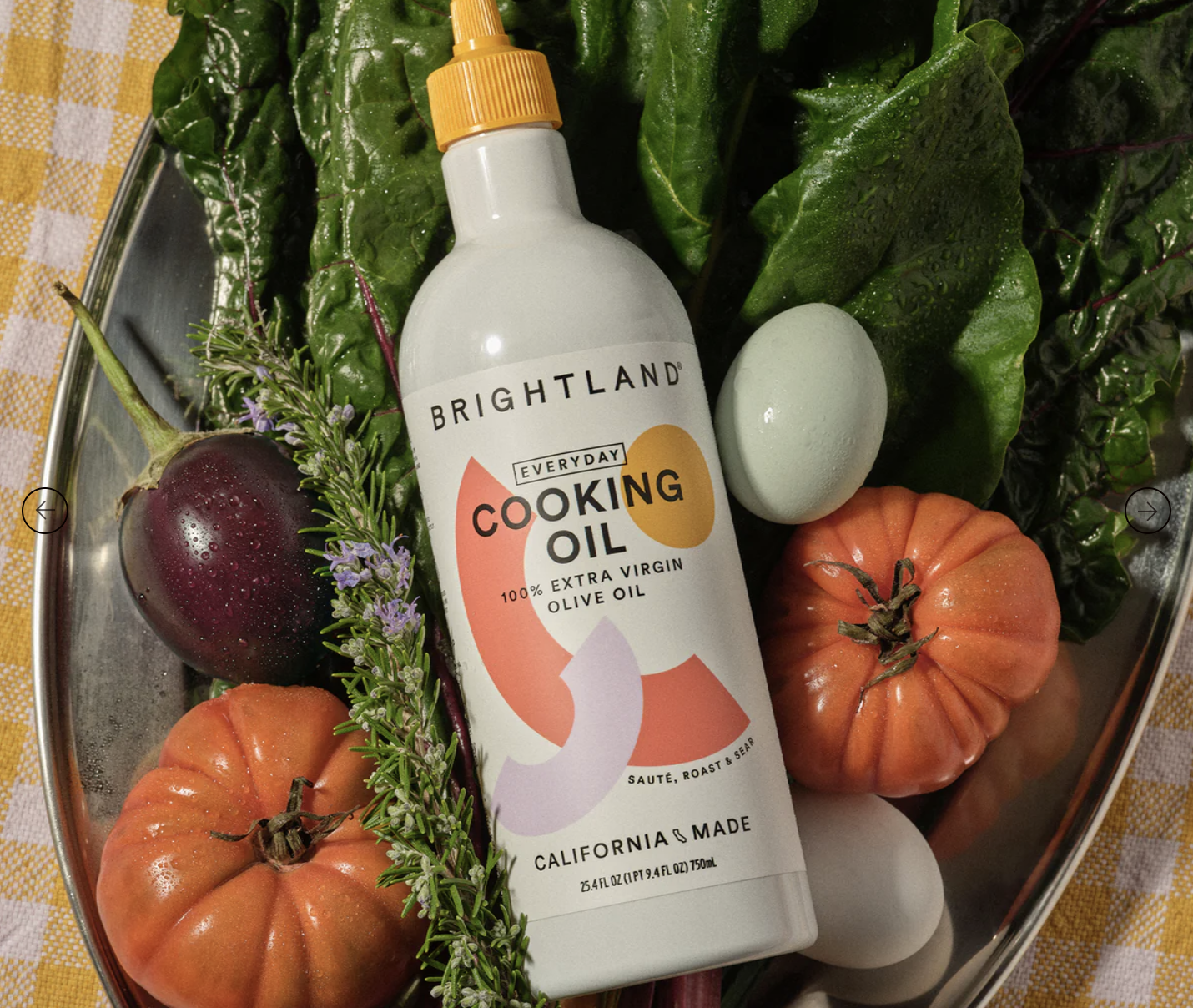
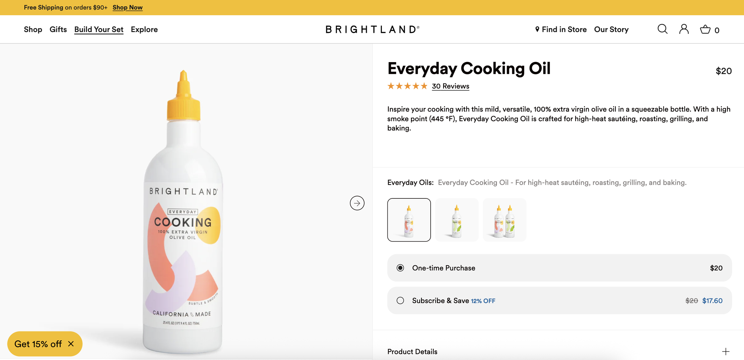
Brightland initially engaged me to write packaging copy for a new cooking oil packaged in a squeeze bottle—a product designed to compete in the rapidly growing everyday cooking oil category. But as I dug into the project, it became clear that packaging copy alone wouldn't solve the challenge.
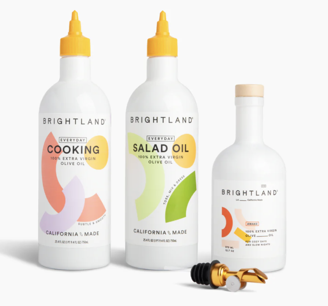
The new product needed a distinct identity within the Brightland portfolio while still feeling unmistakably part of the brand. Rather than approaching the assignment as a standalone copy project, I proposed a broader strategic framework: defining a scalable messaging architecture, visual language, and packaging system that could support not just one product launch, but an entire future product family.
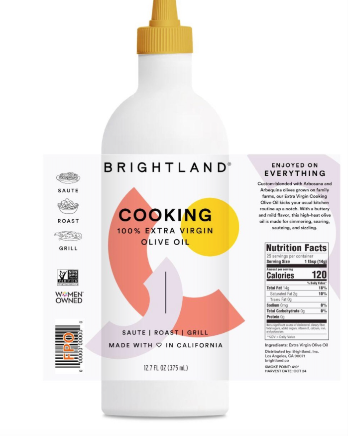
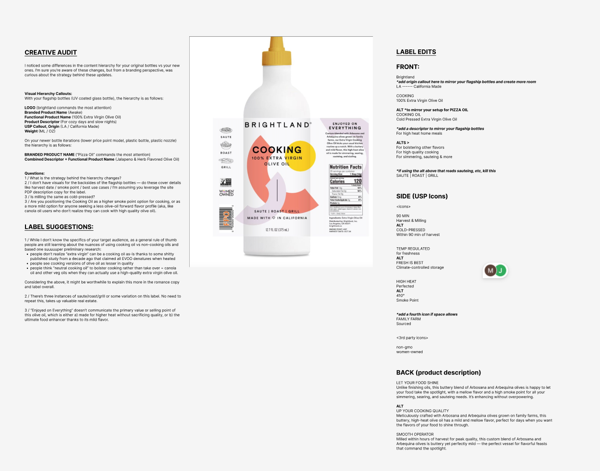
Working closely with the team, I helped shape what became Brightland's "everyday" line—a more accessible, daily-use extension of the brand that now includes both Cooking Oil and Salad Oil. Beyond writing all packaging copy, I developed product positioning, naming and messaging frameworks, packaging callout systems, iconography recommendations, and visual design direction that more clearly connected the new products back to Brightland's flagship olive oil portfolio.
My role ultimately expanded into creative direction, helping establish a cohesive system that balanced shelf distinction, customer clarity, and long-term scalability. The result was a packaging and messaging platform designed not just for a single SKU, but for future innovation across the category—ensuring every new product could feel both fresh and unmistakably Brightland.